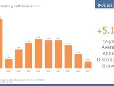

It’s a perennial favorite, with investors and industry insiders requesting it over and over again. We wanted to provide a simple number that could be referenced and compared. Something like the GDP growth rate, which on its face is a quick look at the economy, but in reality is a simplified summary of a nuanced subject.
The chart’s appeal is obvious; it paints an easily digestible picture of distribution growth within the MLP space. Unfortunately, this chart is frequently cited without any context. Despite our efforts to provide an explanation of the underlying methodology, it is sometimes misunderstood.
Our Original Methodology
When we originally developed this methodology in 2013, we had hoped to provide a simple and objective view of distribution growth for the space. The reality is, throughout the course of a year, things get messy. Changes in index constituents, due to quarterly and special rebalancings, can have a drastic effect on the overall distribution growth rate of the index. Corporate events and a host of other one-off exceptions must be considered. As you can imagine, a lot has changed in the space over the past five years.
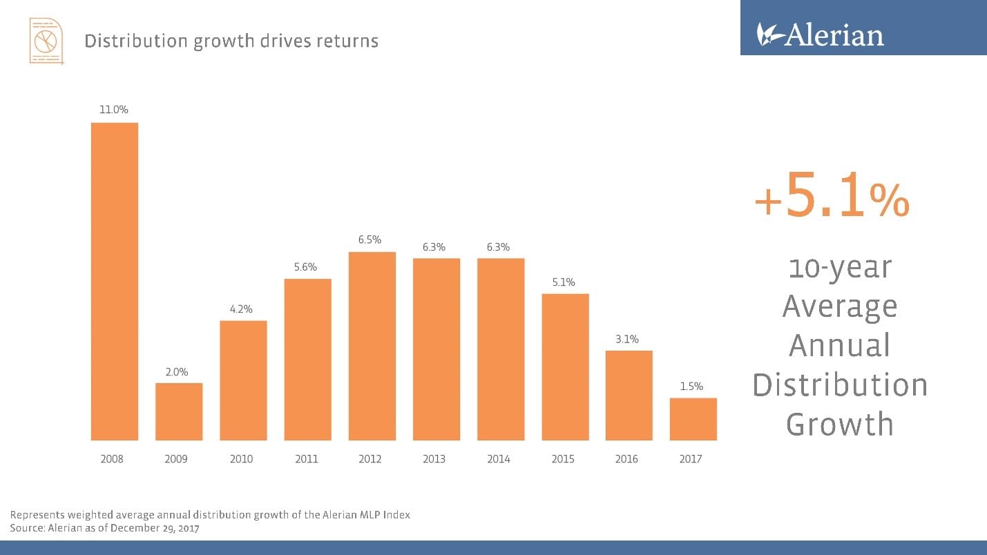
After speaking with a number of MLP stakeholders, ranging from retail investors to professional fund managers, it seems like all people really want is to see “where has the cash gone?”. With this post, we hope to paint a straightforward picture of what the constituents of the Alerian MLP Index (AMZ) have directly paid out over time.
Show me the Money

Why is it so different from our original chart? Well, if we look at our original calculation methodology (seriously, just read it), you’ll see that we looked at the distribution growth rates of each MLP on a quarterly basis. We then scaled the growth rates by each constituent’s weight in the index, applied that overall quarterly growth rate to an indexed value, and then compared the indexed values on an annual basis.
Instead of looking at quarterly growth rates, the new visualization directly compares what MLPs in the index are paying out on an annualized basis. As the chart title suggests, we examine the annual normalized total distributions. We then compare that value to the previous year’s value to calculate the percentage change. The term “normalized” means that the overall amount is adjusted by the index divisor to take into account index rebalancings. (For a full explanation of normalized total distributions and how the index divisor works, please scroll to the very bottom of this post to the appendix.)
So, what?
Under this new methodology, distribution cuts and rebalancings have a more pronounced impact. For example, a trend that we noticed in 2015 was that many high-yield, small-cap MLPs cut their distributions. Specifically, exploration and production MLPs like BreitBurn Energy Partners LP (BBEP), Linn Energy LLC (LINE), Legacy Reserves LP (LGCY), and Vanguard Natural Resources LLC (VNR) took the brunt of the energy downturn.
These drastic distribution cuts led to a decline in their equity price, causing a downwards spiral that eventually left them ineligible for index inclusion. Those names were then replaced with lower-yielding MLPs who weathered the downturn better than their higher-yielding peers. That combination of factors led to a steep drop off in overall cash distributions paid by index constituents.
In 2016, we saw much of the same, with a continuation of distribution cuts led primarily by small-cap MLPs in the AMZ that lacked well-capitalized balance sheets. However, the contagion eventually spread to larger-cap names such as Plains All American Pipeline (PAA) and Energy Transfer Partners (ETP). At the time, we did a quick analysis on The Upside of MLP Distribution Cuts, which could be worth a read if you want to revisit those events.
The market saw fewer cuts in 2017, but those cuts included several large-cap names. Plains All American Pipeline (PAA) cut its distribution a second time, while Enbridge Energy Partners (EEP) and Williams Partners (WPZ) followed. With these larger MLPs cutting distributions, the effect was still felt throughout the index, but since they weren’t being replaced with even lower-yielding names, the overall effect was less pronounced.

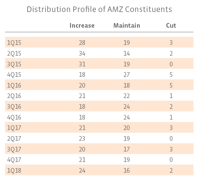
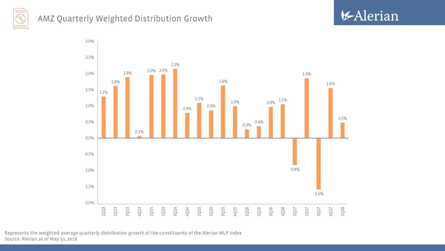
It’s interesting to note that throughout this period of distribution cuts, the vast majority of MLPs in the AMZ still increased or maintained their distributions. Although the original distribution growth chart may not have truly reflected what investors experienced, we believe that this data still adds value. Going forward, instead of publishing an annual indexed figure, we’re going to publish the underlying weighted quarterly distribution growth figures, as seen below. Furthermore, we’ll continue to put out quarterly distribution recaps, adding context to the numbers.

At the end of the day, we at Alerian strive to provide the most objective and transparent view into the MLP space. Our mission is to equip investors to make informed decisions about MLPs and energy infrastructure and we hope this overview gives investors a better understanding of MLP distribution trends.
++++++++
Appendix
As promised, here are the nitty gritty details on our calculation methodology. We’ll start by quickly walking through how we calculate the index.
The AMZ’s total adjusted market capitalization (AMC) is calculated by taking
Price * Shares Outstanding * Float * Cap
for every equity and summing them all together. That ends up being a very large number that’s difficult to quote. Who wants to say that the AMZ’s level is currently at 141,788,578? To make the index level a more sensible number to quote on a daily basis, an arbitrary number called a divisor is defined at the index’s inception. So, we divide that AMC by the divisor! This gives us our handy dandy index value. However, it’s important to note that the divisor doesn’t stay constant, it is adjusted at every index rebalancing to account for material changes to the underlying constituents. If a company is taken out of the index in a special rebalancing overnight, we want the opening price of the index to be the same, even if the AMC changes. Thus, the divisor is adjusted by the appropriate amount to keep the closing and opening index values consistent.
Okay, now that we’ve gotten that out of the way, let’s talk about adjusted total distributions (ATD). The source of all that juicy yield MLPs are known for. The way we calculate ATD is pretty much the same process as calculating AMC, except instead of price in the AMC calculation, we use each company’s annualized distribution (based off a company’s latest announced distribution), making the formula:
Annualized Distribution * Shares Outstanding * Float * Cap
We then sum up the values for all the index constituents and get ATD! Fun fact, the yield of the index is merely ATD/AMC. However, because names are coming in and out of the index, to make the ATD value comparable from one rebalancing period to the next, we must factor in the divisor, giving us a normalized total distribution value for the index. The change in that final number, calculated annually on December 31st of each year, is what the chart above depicts.

