

Looking at the table above, you’ll notice that there are 24 MLPs in the AMLI, which makes up around 70% of the overall energy MLP market cap, showing just how top-heavy this industry is today. While this is an interesting data point, it’s just that, a single data point that just shows how the industry is today. How did these size indices stack up historically? What kind of story can you tell when you peer into the looking glass and take snap shots into the past? Well, lucky for you we’ve done that work and back-tested all of these indices for the past decade, meticulously applying our methodology to provide the most accurate picture of how our niche industry has grown.

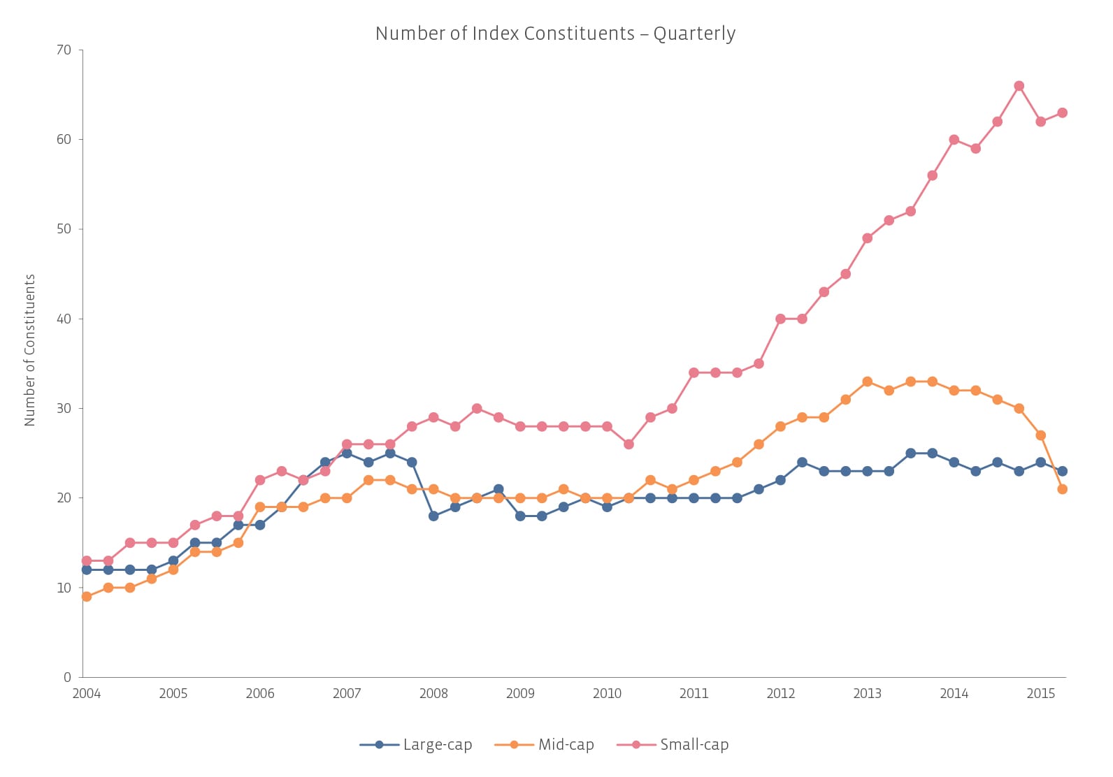
The above chart shows the number of constituents in each index on a quarterly basis. Between 2004 and 2008, there was a more equal distribution among each segment. After the 2008 financial crisis and recovery, the space began to see an explosion of growth, coming primarily from new IPOs, swelling the ranks of the small and mid-cap indices. Recently, during the commodity collapse, we’ve seen another adjustment in market capitalization distribution, with both the number of small- and mid-cap names falling. This redistribution of market capitalization is a result of more commodity-sensitive names facing financial difficulties and falling from the grace of investors. Although the above chart ostensibly shows the number of mid-cap names declining dramatically while the number of small-cap names staying relatively constant, it fails to fully communicate the changing dynamics of the space.
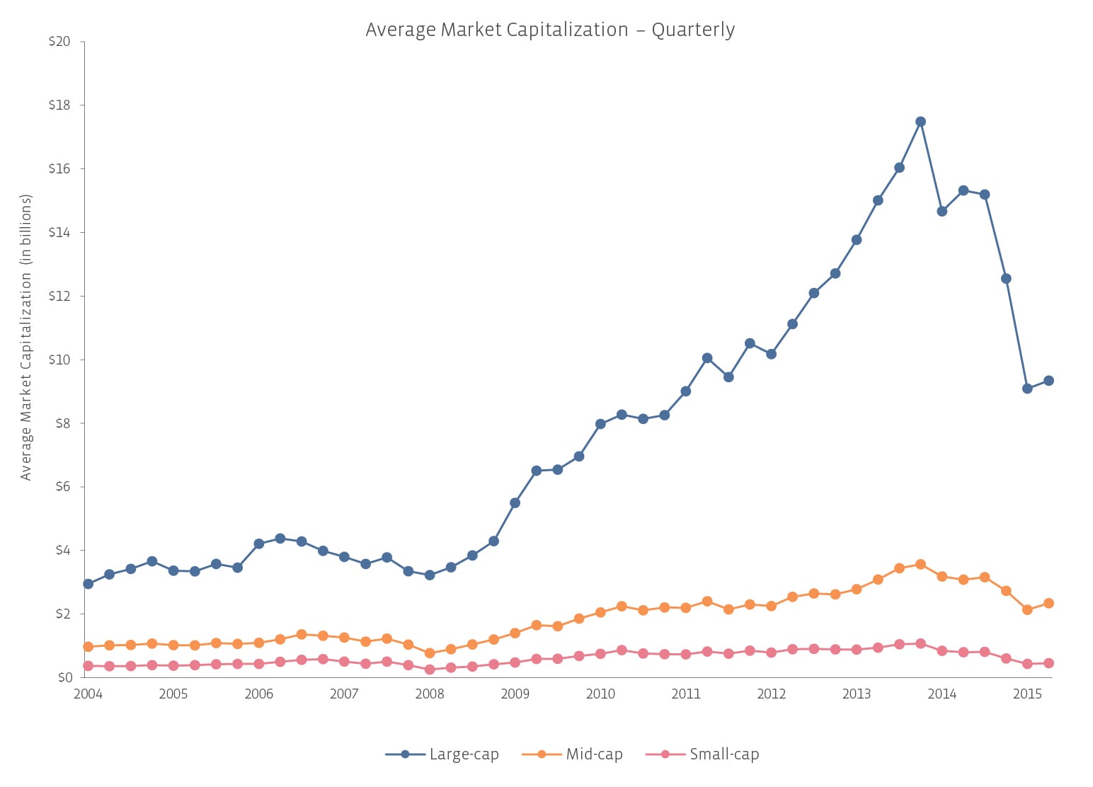
For example, in the most recent quarterly rebalancing on March 18, 2016, seven names were removed from the AMMI and two equities were added for a net loss of five companies. One of the seven was added to the AMLI while the other six dropped down to the AMSI. However, in the AMSI, four equities were removed for failing to meet the minimum market capitalization requirement of at least $75 million, giving it a net gain of two names. So while it may seem like mid-cap names took the biggest hit for number of companies removed, in reality, small-cap names were hit almost as hard. The losses to the AMSI were just offset by the addition of former AMMI constituents. Again, keep in mind that this is only the number of constituents for each index; it’s not a reflection of the actual performance of size of the space, just how it has been divided. Another way to look at the history of the size indices is to examine the average market capitalization of each index’s constituents, as shown below.

As you can tell, average market capitalizations of companies in the AMSI and AMMI have risen modestly in the past decade, while the AMLI has skyrocketed, falling only during the most recent commodity collapse. This chart above highlights the primary reason why a specific cut-off value for each segment doesn’t make sense. As the space evolves, the definition of each cut-off point changes with it, which is why we’ve designed our index in a way that’s both all-encompassing and flexible.
Some may look at the above chart and interpret it as the large-cap indices having the most growth during the good years, as well as the steepest drop during the bad years. However, the above chart doesn’t reflect the return performance of the index; it only shows the quarterly change in average market capitalization. The scale of the chart can be disproportionately misleading. In fact, from the September 2014 peak to the March 2016 rebalancing, the average market cap for small-cap MLPs fell -57% versus -42% for large-cap MLPs and -32% for mid-cap MLPs.
Our next article in this series will address these issues and examine how each index has performed throughout the years. We can’t tell you where to put your money today, but we can show you where it would’ve grown the most in the past. Tune in next time to learn about what shocking (or not so shocking) data points we’ve uncovered!

