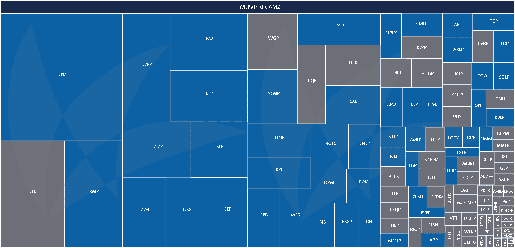
What does it mean that Enterprise is the largest MLP? How much larger is it? What’s the next largest? And the one after that? How much impact do newer MLPs have on the size of the space? Sometimes, numbers alone aren’t the easiest to understand and all we can see is the code.
This month, we decided to take a basic treemap of all 116 MLPs, sorted by market capitalization, and color code it to show various aspects of the MLP space. The two smallest, Oxford Resource Partners (OXF) and Central Energy Partners (ENGY), have such small market capitalizations that even at the highest resolution, it is difficult to distinguish them in the lower right hand-corner. But they are there.
Kinder Morgan and Enterprise Products Partners (EPD) are frequently cited as the two largest MLPs, but it doesn’t look like this on the treemap. That’s because Kinder Morgan is currently a family of companies composed of Kinder Morgan Inc (KMI), Kinder Morgan Energy Partners (KMP), Kinder Morgan Management (KMR), and El Paso Pipeline Partners (EPB). Only KMP and EPB are included in the treemap and separately at that.
We highlighted all the AMZ constituents as of the September 19 rebalancing. The AMZ is our flagship index, and we’ve been fortunate to have it become the leading gauge of large- and mid-cap energy MLPs. We hope this visual helps make it clear how the 50 names in the AMZ do encompass 74.4% of the total MLP market cap. If you’re wondering why some names aren’t included, we will refer readers to our methodology guide. All names in the AMZ must satisfy Tier 1 criteria, which is why, for example, that you’ll see variable distribution MLPs and general partnerships excluded.
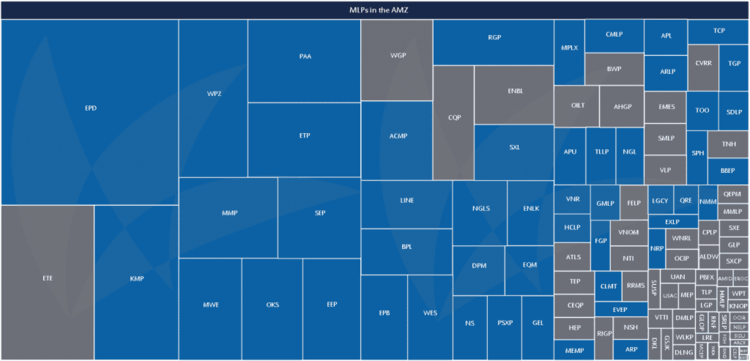
I realize the type is tiny, and the tickers are hard to read. Click on the image to see a larger, downloadable version.
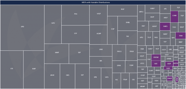
Speaking of MLPs that pay a variable distribution, when we first started to see more IPOs of these names, many investors and stakeholders began questioning if this was the next big thing in MLPs, or if it was just a fad. With 10 names out of 116, that’s a relatively large percentage of companies; however, looking at the treemap in terms of market capitalization, these companies remain a smaller part of the asset class—3.2% to be exact.
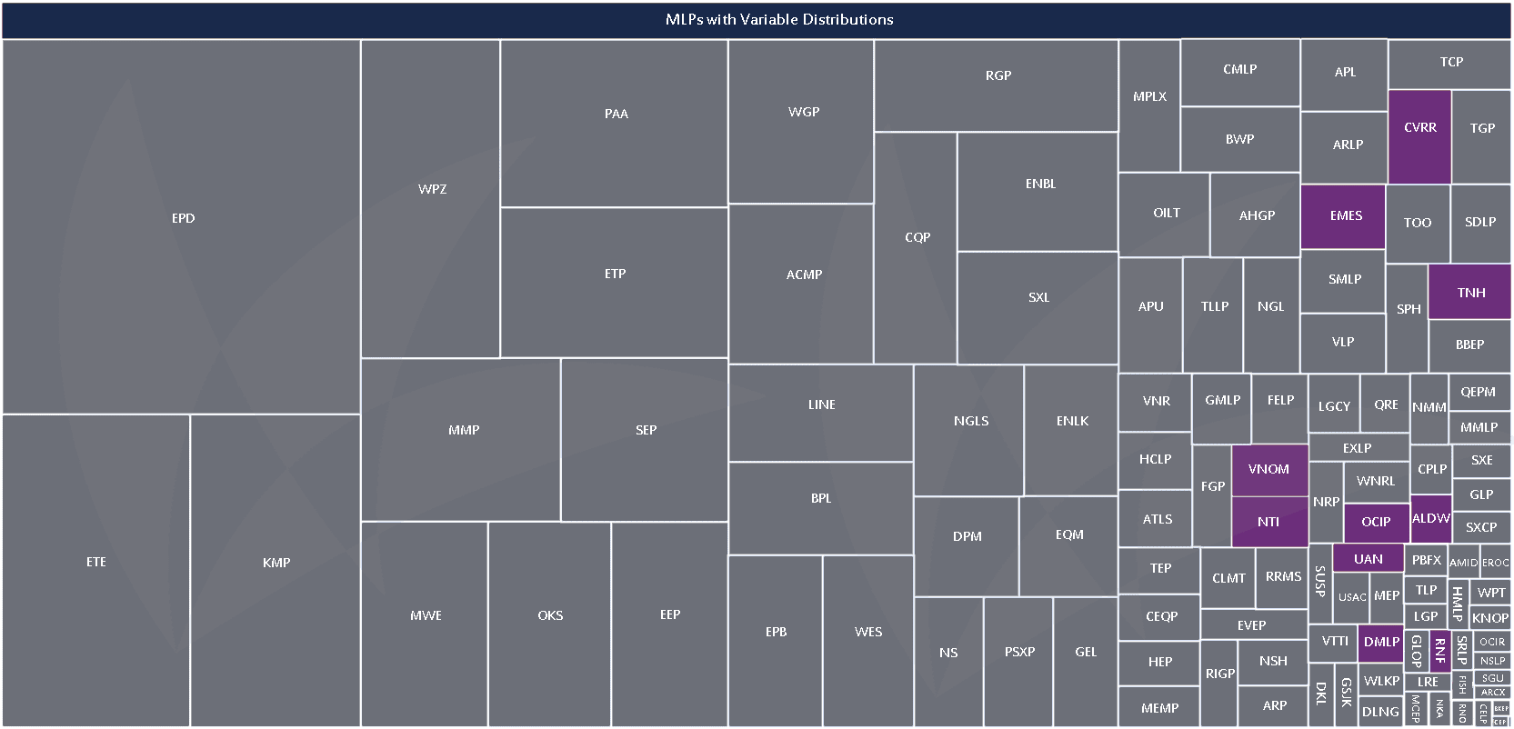 Are variable distribution MLPs a trend?
The 17 MLPs that completed their IPOs in the past 12 months represent 5.1% of MLP market capitalization. Ten of these completed their IPOs in 2014, while the remaining seven went public in 2013. These recent MLPs have an average market cap of $1.8 billion, and a median market cap of $1.1 billion. The largest is Enable Midstream Partners (ENBL) at $11 billion, and the smallest is Cypress Energy Partners (CELP) at $290 million.
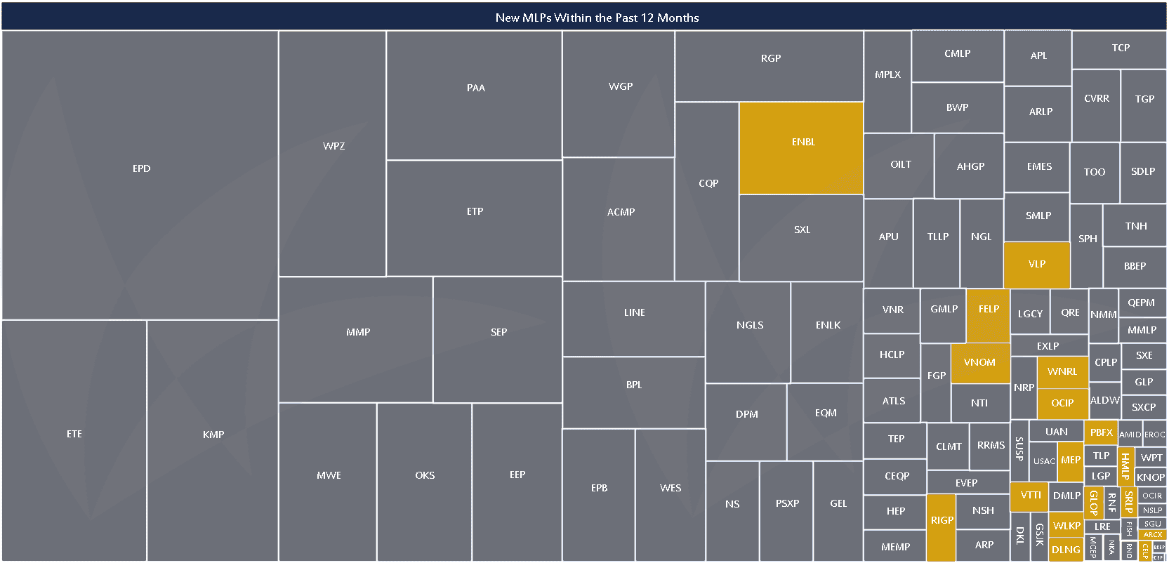 Seventeen MLPs completed their IPOs between September 17, 2013 and September 17, 2014.
The bulls will tell you that growing distributions are a hallmark of the space. And with good reason – it’s easy to see that the vast majority of MLPs, whether measured by market cap or by number, are growing their distributions.
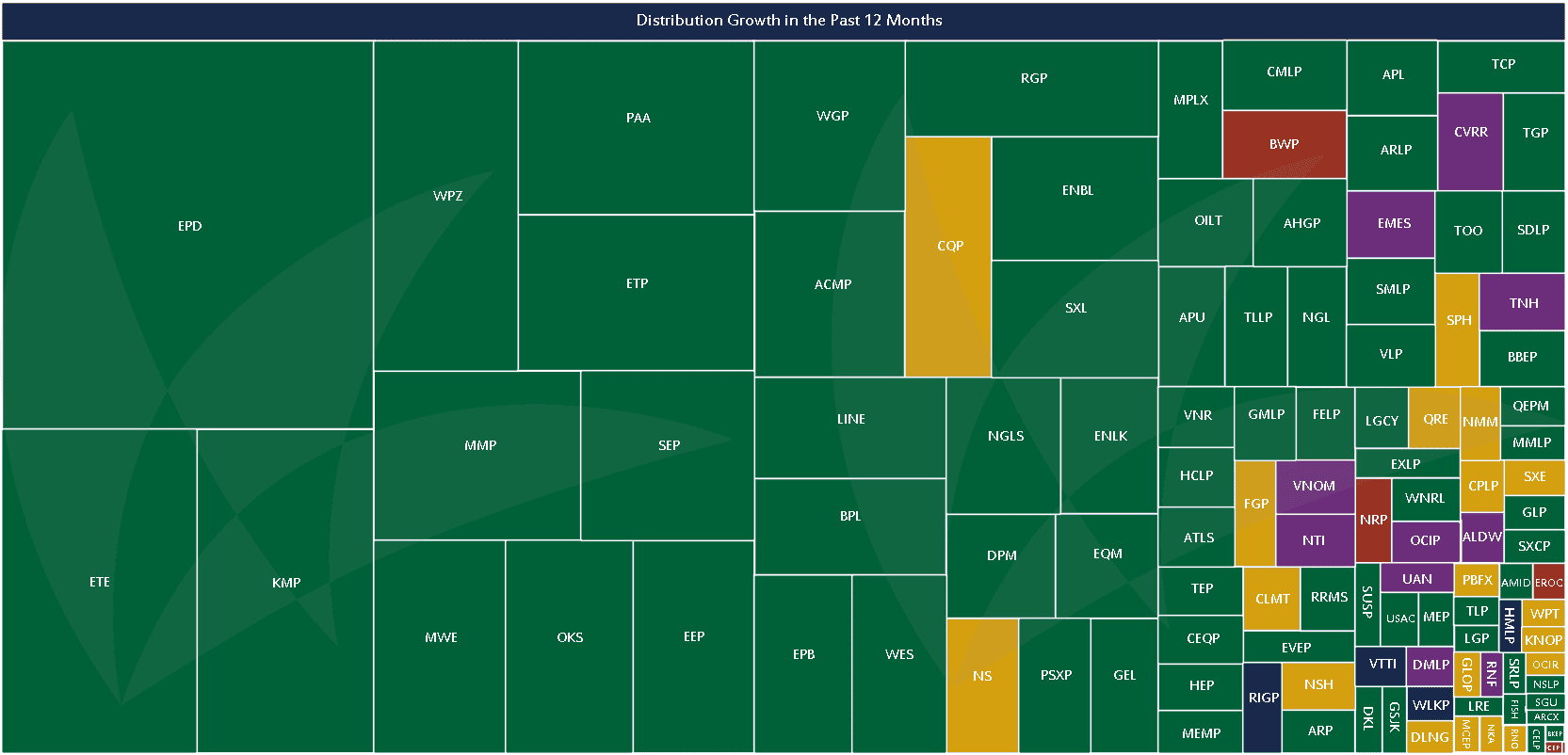
Data calculated from 2013Q3 to 2014Q3. MLPs that raised their distribution in the past year are green. MLPs that maintained their distribution during the past year are yellow. MLPs that cut their distribution in the past year are red. Variable distribution MLPs, as listed above, are purple. The blue MLPs are those that completed their IPO during the third quarter so they have not yet announced their first distribution.
We encourage readers to flip back and forth between these charts, noticing where patterns emerge and where they overlap. If there’s another pattern or distinction you’re curious about, please drop us a line at [email protected] – we’d love to hear your suggestions. We’ll be adding onto this theme in the future with heatmap and treemap combinations. Because it’s one thing to know an MLP grew its distribution, but a company growing its distribution by 2% is very different from a company growing its distribution by 20%.


