Chart patterns are a useful tool because they occur regularly, offering investors many trade candidates. ETF chart patterns provide investors with an entry point, stop-loss price, and a profit target. While no strategy is perfect, and chart patterns don’t produce a profit all of the time, learning to use them in trading can greatly enhance one’s ability to analyze and profit from ETFs.
1. Head and Shoulders
The head and shoulders is a topping pattern, signaling that an uptrend is likely over and a downtrend is commencing. The pattern is created when the price rises (left shoulder), then dips, then rises again to a new high (head), declines, then rallies again but not as high as the previous rally (right shoulder).
Usually, the left and right shoulder will reach similar highs, varying marginally from one another [see 3 ETF Trading Tips You Are Missing].
The SPDR Select Sector Financial ETF (XLF ) created a head and shoulders pattern in early 2011, and ultimately foretold a significant top in the ETF.

That the right shoulder is lower than the head shows that the market is losing momentum, although the pattern is not complete until the price moves below the neckline or the breakout point. The neckline is a trendline connecting the lows of the pullbacks, also called “armpits”. The breakout point is simply the lowest point in the pattern. Either can be used as an entry point. But when the price drops below either of these levels it signals a further decline.
Once a trade is made, a stop loss can be placed just above the right shoulder to limit. The total height of the formation, the top of the head minus the lowest low, can be used to establish a profit target as well.
The high of the formation in Figure 1. is $17.20 and the low, between the head and right shoulder, is $16.24. Therefore the height is $0.96. The height is subtracted from the low point of the formation to get a profit target: $16.24 minus $0.96 equals $15.28. In this case, the market fell much further than the target price.
While the pattern can be used to enter short trades, it is also a warning to those that are long that a correction is likely coming.
2. Inverse Head and Shoulders
There is also an inverse head and shoulders pattern which occurs at market bottoms and is the same as the normal head and shoulders only flipped upside down. In the summer of 2012, this pattern appeared in the S&P 500 SPDR ETF (SPY ) and signaled a trend reversal [see also Free Report: How To Pick The Right ETF Every Time].

The neckline, as in Figure 1., is too steep to be of use for an entry signal. Therefore, the pattern completes and an entry is taken when the price moves through the breakout line (high point of the armpits). A stop is placed just below the right shoulder and the target is calculated by adding the height of the formation (high point minus low point of the head) to the breakout price.
3. Triangles
These patterns are quite common, as the three different types of triangles are created by converging price action. Trendlines are used to draw the pattern, and an entry is signaled when the price moves above or below either of the trendlines.
Symmetric
Symmetric triangles occur when the price is making lower highs and higher lows; drawing the trendlines will reveal both moving towards each other. The SPDR Select Sector Technology ETF (XLK ) created a symmetric triangle in late 2012.

The price broke through the upper trendline of the triangle (a long entry trigger), signaling an upside breakout and a move higher. A stop is placed just outside the opposite side of the triangle [see also 5 Simple ETF Trading Tips].
The target is calculated by taking the height of the formation and adding it to the breakout point. In this case, the high was $26.54 and the low was $24.01 for a height of $2.53. The breakout price was $25.90, making the target $28.43.
Ascending
Everything is the same for the ascending triangle except for its look. With an ascending triangle, the ETF is making higher lows, but the highs are reaching similar price levels on each swing. Figure 4. shows how this looks on a chart of the SPDR Dow Jones Industrial Average ETF (DIA ).

Entry, stop losses, and targets are all entered in the same way as a symmetric triangle.
Descending
Descending triangles occur when the price of an ETF is making lower highs, but the lows are reaching similar levels on each swing. A descending triangle occurred in the SPDR Select Sector Utilities ETF (XLU ) in early 2012.

Entry, stop losses, and targets are all entered in the same way as the other two triangle formations.
4. Double Top and Bottom
When looking for a reversal, check for a double top or double bottom pattern. A double top occurs when the price peaks, pulls back and then rallies back to very near the first high. The double top is complete, and a short entry taken, when the price falls below the low of the pullback. Figure 6. shows a double top that occurred in the S&P 500 SPDR ETF in 2012 [see 5 Important ETF Lessons In Pictures].

A stop can be placed above the highs, although this means the risk can be quite large in some cases. The profit target is calculated by taking the height of the formation and subtracting it from the breakout price/low point of the pattern. In this case, the highs reached $141.66 (lower of the two highs) and the pullback low was $135.76, for a height of $5.90. Subtract that from the $135.76 to get a target of $129.86.
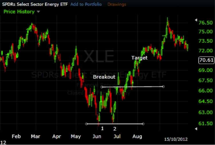
A double bottom indicates a decline has ended and a rise is likely to ensue. Everything is the same as the double top except the pattern is flipped upside down. The SPDR Select Sector Energy ETF (XLE ) experienced a double bottom in mid-2012.
5. Triple Top and Bottom
Triple tops and bottoms are very similar to double tops and bottoms, except there are three price extremes instead of two. The United States Natural Gas Fund (UNG ) shows a triple top at the end of 2010 and early 2011 [Download 101 ETF Lessons Every Financial Advisor Should Learn].

Once the three peaks occur, an entry is signaled when the price moves below the lowest correction in the pattern. A stop is placed above the highest price peak. The target is then calculated by taking the height of the formation and subtracting it from the breakout price. While the trade in this example would not have been stopped out, it did take several months for the price to reach the target.
A triple bottom indicates a decline has ended and a rise is likely to ensue. Everything is the same as the double top except the pattern is flipped upside down. The ProShares UltraShort S&P 500 ETF (SDS ) experienced a triple bottom in mid-2012.

Putting it Together
Chart patterns can greatly enhance one’s ability to trade and analyze ETFs. Not every chart pattern will be profitable, but investors will always know their downside and upside before entering. If the risk is too much, or the reward too little, skip the trade. It will take some time to train your eyes to spot these patterns, but once you start to see them you will be able to capture more trends and avoid more reversals. As always, investors of all experience levels are advised to use stop-loss orders and practice disciplined profit-taking techniques.
Charts made with Freestockcharts.com
[For more ETF analysis, make sure to sign up for our free ETF newsletter or try a free seven day trial to ETF Database Pro]
Disclosure: No positions at time of writing.