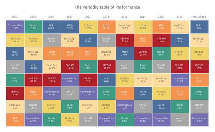
The chart shows performance on a total return basis. The top performer of 2016 was small-cap equities which are represented by the Russell 2000 Index. Some say this banner year is primarily a result of Trump’s election. The idea is that small, US based companies will thrive under Trump’s administration due to planned reductions in corporate taxes, less regulation, and a low risk of new trade policies affecting them.
Right behind the small-cap equites are MLPs! MLPs are represented by the total return version of the Alerian MLP Index (AMZ). MLPs notably outperformed the S&P 500 for the first time since 2011. However, it wasn’t without a lot of volatility. The daily standard deviation of the AMZX over 2016 was 33%, while the standard deviation of SPXT was only 12%. Thus, from a risk-adjusted standpoint, the S&P 500 outperformed MLPs. Much of the volatility experienced in the MLP space during 2016 (and 2015) was linked to oil prices and related investor sentiment. We would not expect to see the same level of heightened volatility over the long term. For reference, the standard deviation for MLPs over the past 10 years has been 19% versus 15% for the S&P 500.
To avoid leaving you wondering, here is a quick list of how the remaining sectors are represented:
- Utilities: S&P 500 Utilities Index (a composite of utility stocks in the S&P 500)
- Commodities: S&P 500 Total Return World Commodity Index
- Bonds: Barclays US Aggregate Total Return Bond Index
- REITs: Real Estate 50 Index (a supplemental benchmark to the FTSE NARIET US Real Estate Index Series to measure the performance of more frequently traded equity REITs)
- Non-US: MSCI Daily Total Return EAFE Index
For more great figures and tables, visit our MLP University. As always, if there is another chart, graph, or statistic that would be helpful and it’s not listed, please contact us at [email protected], and we’ll do our best to provide you with the information.